🔳 Material Button Card
🌟 Overview
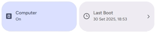
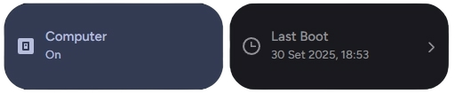
The material-button-card is a super versatile card 🃏 that can be used to display and control a variety of entities in Home Assistant. It can be configured to act as a switch 💡, a button 🔘, a thermometer 🌡️, and much more.
🛠️ Configuration
Here are the configuration options for the material-button-card:
🆓 Free Version
| Name | Type | Description | Default | Required |
|---|---|---|---|---|
type | string | custom:material-button-card | ✅ Yes | |
control_type | string | The type of control the button will have. See Control Types for more information. | generic | ✅ Yes |
name | string | The name to display on the card. 📛 | ❌ No | |
entity | string | The entity ID to associate with the card. 🆔 | ✅ Yes (Not required for action and app_version) | |
use_default_icon | boolean | Use the default icon based on the entity's state. 🖼️ | true | ❌ No |
icon | string | A custom icon to display. ✨ | ✅ Yes (Required if use_default_icon is false) | |
dual_icon | boolean | Use two different icons for the "on" and "off" states. 🎭 | false | ❌ No |
icon_on | string | The icon to display when the entity is "on". ✅ | ✅ Yes (Required if dual_icon is true) | |
icon_off | string | The icon to display when the entity is "off". ❌ | ✅ Yes (Required if dual_icon is true) | |
use_default_text | boolean | Use the default "on" and "off" text. 🔡 | true | ❌ No |
text_on | string | Custom text to display when the entity is "on". | ✅ Yes (Required if use_default_text is false) | |
text_off | string | Custom text to display when the entity is "off". | ✅ Yes (Required if use_default_text is false) | |
use_material_color | boolean | (Only for thermometer) Use different colors based on the state. 🎨 | false | ❌ No |
fix_temperature | string | (Only for thermometer) Set to true or auto to fix temperature display issues. 🔧 | false | ❌ No |
use_default_toggle | boolean | Enable automatic actions based on entity state. If false, you can configure tap_action and hold_action. 🔄 | true | ❌ No |
tap_action | object | Action to perform on tap. See Actions for more information. 👇 | ❌ No | |
hold_action | object | Action to perform on hold. See Actions for more information. HOLD | ❌ No |
✨ Pro - Ultimate Version
| Name | Type | Description | Default | Required |
|---|---|---|---|---|
type | string | custom:material-button-card | ✅ Yes | |
control_type | string | The type of control the button will have. See Control Types for more information. | generic | ✅ Yes |
name | string | The name to display on the card. 📛 | ❌ No | |
entity | string | The entity ID to associate with the card. 🆔 | ✅ Yes (Not required for action and app_version) | |
icon | string | A custom icon to display. ✨ | ❌ No (If Empty will use the default icon based on the entity's state) | |
dual_icon | boolean | Use two different icons for the "on" and "off" states. 🎭 | false | ❌ No |
icon_on | string | The icon to display when the entity is "on". ✅ | ✅ Yes (Required if dual_icon is true) | |
icon_off | string | The icon to display when the entity is "off". ❌ | ✅ Yes (Required if dual_icon is true) | |
use_default_text | boolean | Use the default "on" and "off" text. 🔡 | true | ❌ No |
text_on | string | Custom text to display when the entity is "on". | ✅ Yes (Required if use_default_text is false) | |
text_off | string | Custom text to display when the entity is "off". | ✅ Yes (Required if use_default_text is false) | |
use_material_color | boolean | (Only for thermometer) Use different colors based on the state. 🎨 | false | ❌ No |
fix_temperature | string | (Only for thermometer) Set to true or auto to fix temperature display issues. 🔧 | false | ❌ No |
tap_action | object | Action to perform on tap. See Actions for more information. 👇 | ❌ No (If unspecified, the default action based on the device type will be executed (e.g., Toggle for lights, Dialog for alarms or battery status).) | |
hold_action | object | Action to perform on hold. See Actions for more information. HOLD | ❌ No (If unspecified, the default action based on the device type will be executed (e.g., Toggle for lights, Dialog for alarms or battery status).) | |
double_tap_action | object | Action to perform on double tap. See Actions for more information. HOLD | ❌ No |
🎛️ Control Types
The control_type option determines the behavior and appearance of the card. Here are the possible values:
generic: For generic entities like switches, lights, and input booleans. সুইচthermometer: For climate entities. It will display the temperature and allow you to control the HVAC. 🌡️automation: For automation entities. It will show the automation's state and allow you to trigger it. 🤖scene: For scene entities. Tapping the card will activate the scene. 🎬media_player: For media player entities. It will show the media player's state and provide playback controls. ⏯️state: Displays the state of an entity without any action. ℹ️action: Performs a specific action when tapped. ⚡app_version: Displays the version of the Material Components. 📱
🚀 Actions
🆓 Free Version
You can configure custom actions for tap_action and hold_action.
The action object can have the following properties:
action: The action to perform. Possible values are:toggle: Toggles the entity's state. 🔄more-info: Shows the entity's more-info dialog. ℹ️navigate: Navigates to a specific path. 🗺️url: Opens a URL. 🌐none: No action. 🚫
navigation_path: The path to navigate to whenactionisnavigate.url_path: The URL to open whenactionisurl.
✨ Paid Version
You can configure custom actions for tap_action, hold_action, and double_tap_action. If you do not specify an action, the system will use the default custom dialogs based on the component type.
Action Object Properties
| Property | Type | Description |
|---|---|---|
action | string | Required. The type of action to perform (see list below). |
navigation_path | string | Internal path (e.g., /lovelace/lights) required if the action is Maps. |
url_path | string | External URL (e.g., https://google.com) required if the action is url. |
service | string | The service to call (e.g., light.turn_on) if the action is call-service. |
service_data | object | Additional parameters for the service. |
Possible Values for action
more-info (Default): Opens the entity's details window. When configured, it opens the specific custom dialog for the component. ℹ️toggle: Toggles the entity state (on/off). 🔄call-service: Executes a specific Home Assistant service. 🛠️navigate: Navigates to a specific path within the interface. 🗺️url: Opens an external hyperlink in a new tab. 🌐assist: Opens the Assist interface (voice/text command). 🎙️none: Disables any interaction. 🚫
TIP
Note on Custom Dialogs: If you leave the action as default, the system will automatically trigger the custom dialogs optimized for each category (e.g., the sensor dialog for binary sensors and sensors or the alarm dialog for alarm_control_panel), and more...
📜 Examples
💡 Simple Switch
type: custom:material-button-card
control_type: generic
entity: switch.living_room_light
name: Living Room Light
🌡️ Thermometer with Custom Icons
type: custom:material-button-card
control_type: thermometer
entity: climate.living_room
name: Living Room
use_default_icon: false
dual_icon: true
icon_on: mdi:hvac
icon_off: mdi:hvac-off
🤖 Automation Trigger
type: custom:material-button-card
control_type: automation
entity: automation.turn_on_lights_at_sunset
name: Sunset Lights
🎬 Scene Activation
type: custom:material-button-card
control_type: scene
entity: scene.movie_time
name: Movie Time
icon: mdi:movie
⏯️ Media Player Controls
type: custom:material-button-card
control_type: media_player
entity: media_player.living_room_tv
name: Living Room TV
🗺️ Navigation Button
type: custom:material-button-card
control_type: action
name: Go to Lights
icon: mdi:lightbulb
use_default_toggle: false
tap_action:
  action: navigate
  navigation_path: /lovelace/lights
🎨 Extended Customization
⚠️ LICENSE
Only for PRO and ULTIMATE users, get your licence now 🚀.
This card have a own version of Card-Mod. You can inject custom CSS to override any style or create unique animations.
💡 ADVANCED STYLING
👉 Check out the Styling Guide.