🚨 Material Alarm Card
NOTE
✨ Available on 💎 Pro & Ultimate Version Only
🌟 Overview
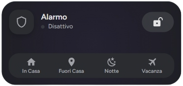
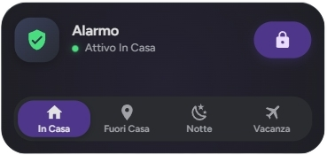
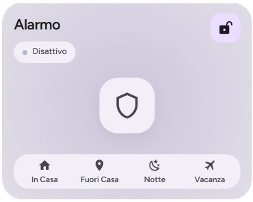
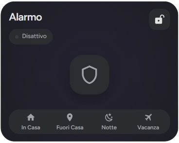
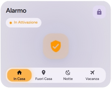
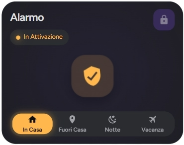
The material-alarm-card is a modern and stylish card 🛡️ for controlling your alarm system in Home Assistant. It supports multiple display styles and provides a user-friendly interface for arming and disarming your security system.
🛠️ Configuration
Here are the configuration options for the material-alarm-card:
| Name | Type | Description | Default | Required |
|---|---|---|---|---|
type | string | custom:material-alarm-card | ✅ Yes | |
entity | string | The alarm control panel entity ID (e.g., alarm_control_panel.home). 🆔 | ✅ Yes | |
name | string | The name to display on the card. 📛 | ❌ No | |
icon | string | A custom icon to display. ✨ | ❌ No | |
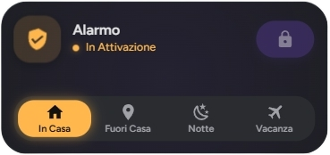
display_style | string | The visual style of the card. Can be compact or extended. 🎨 | compact | ❌ No |
tap_action | object | Action to perform on tap. See Actions for more information. 👇 | ❌ No | |
hold_action | object | Action to perform on hold. See Actions for more information. HOLD | ❌ No | |
double_tap_action | object | Action to perform on double tap. See Actions for more information. HOLD | ❌ No |
NOTE
Check this for Alarm Dialog Settings.
⚙️ Settings Options
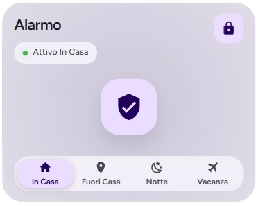
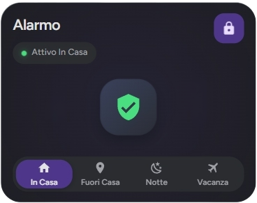
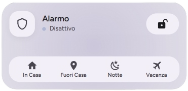
🎨 Display Styles
The display_style option allows you to choose between two different layouts:
compact: A smaller card that fits well in dense dashboards. It shows the status, icon, and basic controls. 📦
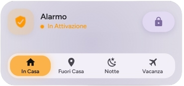
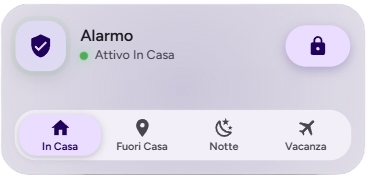
extended: A larger, more detailed card with a prominent status indicator and easier access to controls. 📏
🚀 Actions
You can configure custom actions for tap_action, hold_action, and double_tap_action. If you do not specify an action, the system will use the default custom dialogs based on the component type.
Action Object Properties
| Property | Type | Description |
|---|---|---|
action | string | Required. The type of action to perform (see list below). |
navigation_path | string | Internal path (e.g., /lovelace/lights) required if the action is Maps. |
url_path | string | External URL (e.g., https://google.com) required if the action is url. |
service | string | The service to call (e.g., light.turn_on) if the action is call-service. |
service_data | object | Additional parameters for the service. |
NOTE
Check Settings for more options.
Possible Values for action
more-info (Default): Opens the entity's details window. When configured, it opens the specific custom dialog for the component. ℹ️call-service: Executes a specific Home Assistant service. 🛠️navigate: Navigates to a specific path within the interface. 🗺️url: Opens an external hyperlink in a new tab. 🌐assist: Opens the Assist interface (voice/text command). 🎙️none: Disables any interaction. 🚫
TIP
Note on Custom Dialogs: If you leave the action as default, the system will automatically trigger the custom dialogs optimized for each category (e.g., the sensor dialog for binary sensors and sensors or the alarm dialog for alarm_control_panel), and more...
📜 Examples
🔒 Basic Configuration
type: custom:material-alarm-card
entity: alarm_control_panel.home_alarm
name: Home Security
📏 Extended Style
type: custom:material-alarm-card
entity: alarm_control_panel.home_alarm
display_style: extended
name: Main House Alarm
🎨 Extended Customization
⚠️ LICENSE
Only for PRO and ULTIMATE users, get your licence now 🚀.
This card have a own version of Card-Mod. You can inject custom CSS to override any style or create unique animations.
💡 ADVANCED STYLING
👉 Check out the Styling Guide.