🎚️ Material Slider Card
🌟 Overview
The material-slider-card is a sleek, touch-friendly slider for Home Assistant Lovelace dashboards. It provides an intuitive way to control lights, covers, and other adjustable entities with a modern Material Design look.
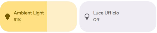
✨ Editor Preview
When adding a new material-slider-card via the UI editor, you will see a pre-configured preview to help you get started.
The preview defaults to:
- Entity: A random light entity from your system (if available)
- Icon: 💡 (
mdi:lightbulb) - Percentage: Visible
NOTE
As soon as you modify any setting in the editor, the preview defaults are cleared, allowing you to fully customize the card.
🛠️ Configuration Options
🆓 Free Version
| Option | Type | Description | Default | Required |
|---|---|---|---|---|
type | string | Must be custom:material-slider-card. | - | ✅ Yes |
entity | string | The entity ID to control (e.g., light.living_room, cover.blinds). | - | ✅ Yes |
control_type | string | Defines the type of control. Options: light, cover. | light | ✅ Yes |
name | string | Custom name to display on the card. | Entity name | ❌ No |
icon | string | Custom icon to display. | Entity icon | ❌ No |
show_percentage | boolean | Displays the current percentage value on the card. | false | ❌ No |
bold_text | boolean | Makes the percentage text bold. | false | ❌ No |
height | number | Custom height of the card in pixels. | - | ❌ No |
use_default_toggle | boolean | Enables default tap/hold actions (toggle/more-info). | true | ❌ No |
tap_action | object | Custom action on tap. | toggle | ❌ No |
hold_action | object | Custom action on hold. | more-info | ❌ No |
✨ Pro - Ultimate Version
| Option | Type | Description | Default | Required |
|---|---|---|---|---|
type | string | Must be custom:material-slider-card. | - | ✅ Yes |
entity | string | The entity ID to control (e.g., light.living_room, cover.blinds). | - | ✅ Yes |
control_type | string | Defines the type of control. Options: light, cover. | light | ✅ Yes |
name | string | Custom name to display on the card. | Entity name | ❌ No |
icon | string | Custom icon to display. | Entity icon | ❌ No |
attribute | string | The specific attribute to control (e.g., brightness, red, hue). | brightness (for lights) | ❌ No |
show_percentage | boolean | Displays the current percentage value on the card. | false | ❌ No |
bold_text | boolean | Makes the percentage text bold. | false | ❌ No |
colorize | boolean | Applies the entity's color (e.g., light color) to the slider background. | false | ❌ No |
background_color | string | Applies the background color when the slider is on. | false | ❌ No |
text_color | string | Applies the text color when the slider is on. | false | ❌ No |
height | number | Custom height of the card in pixels. | - | ❌ No |
min | number | Minimum value for the slider. | 0 | ❌ No |
max | number | Maximum value for the slider. | 100 | ❌ No |
tap_action | object | Custom action on tap. | toggle | ❌ No |
hold_action | object | Custom action on hold. | more-info | ❌ No |
double_tap_action | object | Custom action on double tap. | more-info | ❌ No |
💡 Light Control
The primary use case is controlling lights. The slider adjusts brightness by default but can be configured for other attributes.
Basic Light Slider
type: custom:material-slider-card
entity: light.kitchen_lights
control_type: light
Color Control (Hue)
Control the hue of a light instead of brightness.
type: custom:material-slider-card
entity: light.led_strip
control_type: light
attribute: hue
min: 0
max: 360
colorize: true
🪟 Cover Control
Supports blinds, shutters, and curtains. The slider controls the position (0% = closed, 100% = open).
Basic Cover Slider
type: custom:material-slider-card
entity: cover.living_room_blinds
control_type: cover
icon: mdi:blinds
show_percentage: trueNote: For covers, the attribute is automatically handled as current_position, and min/max are fixed to 0-100.
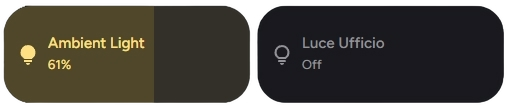
🎨 Styling & Customization
You can customize the appearance using specific configuration options or CSS variables.
Custom Colors & Borders
type: custom:material-slider-card
entity: light.bedroom
control_type: light
height: 60
border_radius: 12px
background_color: "#2c2c2c"
text_color: "#ffffff"
CSS Variables
Use these in your theme for global styling:
| Variable | Description |
|---|---|
--bsc-background | Background color of the slider track. |
--bsc-slider-color | Color of the active slider bar. |
--bsc-primary-text-color | Color of the text (name/percentage). |
--bsc-border-radius | Border radius of the card. |
⚡ Advanced Actions
You can override the default tap and hold actions.
type: custom:material-slider-card
entity: light.study
control_type: light
use_default_toggle: false
tap_action:
  action: call-service
  service: light.turn_on
  service_data:
    entity_id: light.study
    brightness_pct: 100
hold_action:
  action: navigate
  navigation_path: /lovelace/settings
🎨 Extended Customization
⚠️ LICENSE
Only for PRO and ULTIMATE users, get your licence now 🚀.
This card have a own version of Card-Mod. You can inject custom CSS to override any style or create unique animations.
💡 ADVANCED STYLING
👉 Check out the Styling Guide.