🖼️ Material Options Card
NOTE
✨ Available on 💎 Pro & Ultimate Version Only
🌟 Overview
The material-options-card is a versatile Lovelace card designed to create navigation buttons, menus, or entity controls with a clean, modern style inspired by Material Design.
It is perfect for building settings pages, quick links, or elegant entity toggles.
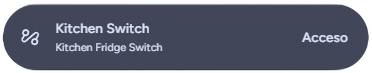
🔧 Dynamic Mode On
✨ Editor Preview
To make configuration easier, when you add a new material-options-card via the Home Assistant UI editor, you will see a pre-filled preview.
The card will initially display with these placeholder values:
- Name: "Material Options"
- Subtitle: "Subtitle"
- Icon: ⚙️ (
mdi:cog)
NOTE
These are just placeholders to show you what the card looks like.
As soon as you start editing any field in the visual editor (e.g., typing a name or selecting an entity), these default preview values will automatically disappear, leaving you with a clean configuration to customize.
🛠️ Configuration Options
Below is a complete list of options available to customize the material-options-card.
| Option | Type | Description | Default | Required |
|---|---|---|---|---|
type | string | Must be custom:material-options-card. | - | ✅ Yes |
name | string | 📝 The main text displayed on the card. | - | ❌ No |
label | string | 📜 Secondary text displayed below the name. | - | ❌ No |
entity | string | 🔗 The entity ID to associate with the card. Enables state-based features (dynamic icons, toggles). | - | ❌ No |
options_type | string | 🎨 Card style. Can be options (standard) or dynamic (changes style when entity is ON). | options | ❌ No |
icon | string | 🖼️ The icon to display. If not set and an entity is provided, the entity's icon is used. | - | ❌ No (If Empty will use the default icon based on the entity's state) |
dual_icon | boolean | 🔄 Enables different icons for on and off states. Requires entity. | false | ❌ No |
icon_on | string | 💡 Icon to show when the entity is on. Requires dual_icon: true. | - | ❌ No |
icon_off | string | 🌑 Icon to show when the entity is off. Requires dual_icon: true. | - | ❌ No |
border_radius_style | string | 📐 Border radius style. Options: small, medium, large, custom. | small | ❌ No |
border_radius | string | 📏 Custom CSS border radius value (e.g., 20px). Requires border_radius_style: custom. | - | ❌ No |
use_large_buttons | boolean | 🐘 Increases padding for a larger, more spacious look. | false | ❌ No |
display_text_inline | boolean | ↔️ Displays the name and subtitle on the same line. | false | ❌ No |
include_entity_options | boolean | 📊 Displays the entity's current state value on the right side. Requires entity. | false | ❌ No |
tap_action | object | 👆 Custom action for a single tap. | more-info | ❌ No (If unspecified, the default action based on the device type will be executed (e.g., Toggle for lights, Dialog for alarms or battery status).) |
hold_action | object | 👆🏼 Custom action for a long press. | - | ❌ No (If unspecified, the default action based on the device type will be executed (e.g., Toggle for lights, Dialog for alarms or battery status).) |
double_tap_action | object | ✌️ Custom action for a double tap. | - | ❌ No |
🚀 Usage Examples
1. Simple Navigation Card
Creates a button that navigates to another dashboard view.
type: custom:material-options-card
name: Lights
label: Go to lights section
icon: mdi:lightbulb-group
tap_action:
  action: navigate
  navigation_path: /lovelace/lights
2. Entity Control (Switch)
Controls a switch. Tapping toggles it, holding opens a dialog.
type: custom:material-options-card
entity: switch.desk_socket
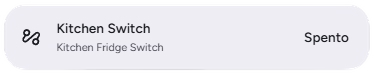
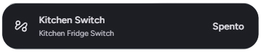
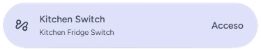
options_type: dynamic # Background changes when switch is ON
include_entity_options: true # Shows state (On/Off)3. Dual Icons
Shows a different icon depending on whether a window is open or closed.
type: custom:material-options-card
entity: binary_sensor.living_room_window
name: Living Room Window
dual_icon: true
icon_on: mdi:window-open-variant
icon_off: mdi:window-closed-variant
include_entity_options: true
4. Custom Style
A larger card with custom rounded corners.
type: custom:material-options-card
name: Scenes
label: Activate your favorite scenes
icon: mdi:palette-outline
use_large_buttons: true
border_radius_style: custom
border_radius: 28px
🎨 Extended Customization
⚠️ LICENSE
Only for PRO and ULTIMATE users, get your licence now 🚀.
This card have a own version of Card-Mod. You can inject custom CSS to override any style or create unique animations.
💡 ADVANCED STYLING
👉 Check out the Styling Guide.