🔗 Material Control Card
🌟 Overview
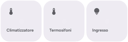
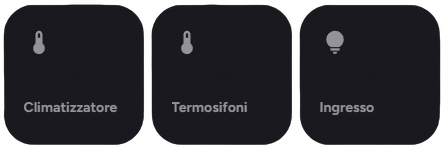
The material-control-card is a versatile card designed to trigger actions, navigate between views, or control entities with a clean, button-like interface.
It is built on top of the powerful custom:button-card but simplifies configuration for common use cases.
✨ Editor Preview
When adding a new material-control-card via the UI editor, you will see a pre-configured preview.
The preview defaults to:
- Name: "Control Card"
- Icon: 🔗 (
mdi:link) - Action: More Info
Note: As soon as you modify any setting in the editor, the preview defaults are cleared, allowing you to fully customize the card.
🛠️ Configuration Options
🆓 Free Version
| Option | Type | Description | Default | Required |
|---|---|---|---|---|
type | string | Must be custom:material-control-card. | - | ✅ Yes |
name | string | 📝 The text displayed on the card. | "Control Card" | ❌ No |
use_card_entity | boolean | 🔗 Enables linking the card to a specific entity. | false | ❌ No |
entity | string | The entity ID to associate with the card. Required if use_card_entity is true. | - | ❌ No |
use_default_icon | boolean | 🖼️ Uses the entity's default icon if available. | true | ❌ No |
icon | string | Custom icon to display. | mdi:link | ❌ No |
dual_icon | boolean | 🔄 Enables different icons for on and off states. Requires entity. | false | ❌ No |
icon_on | string | 💡 Icon to show when the entity is on. Requires dual_icon: true. | - | ❌ No |
icon_off | string | 🌑 Icon to show when the entity is off. Requires dual_icon: true. | - | ❌ No |
tap_action | object | 👆 Action to perform on tap. | more-info | ❌ No |
hold_action | object | 👆🏼 Action to perform on hold. | none | ❌ No |
✨ Pro - Ultimate Version
| Option | Type | Description | Default | Required |
|---|---|---|---|---|
type | string | Must be custom:material-control-card. | - | ✅ Yes |
name | string | 📝 The text displayed on the card. | "Control Card" | ❌ No |
use_card_entity | boolean | 🔗 Enables linking the card to a specific entity. | false | ❌ No |
entity | string | The entity ID to associate with the card. Required if use_card_entity is true. | - | ❌ No |
icon | string | Custom icon to display. | mdi:link | ❌ No (If Empty will use the default icon based on the entity's state) |
dual_icon | boolean | 🔄 Enables different icons for on and off states. Requires entity. | false | ❌ No |
icon_on | string | 💡 Icon to show when the entity is on. Requires dual_icon: true. | - | ❌ No |
icon_off | string | 🌑 Icon to show when the entity is off. Requires dual_icon: true. | - | ❌ No |
tap_action | object | 👆 Action to perform on tap. | more-info | ❌ No |
hold_action | object | 👆🏼 Action to perform on hold. | none | ❌ No |
double_tap_action | object | 👆🏼 Action to perform a double tap. | ❌ No |
🚀 Usage Examples
1. Simple Navigation Button
Creates a button that navigates to the "Lights" dashboard view.
type: custom:material-control-card
name: Go to Lights
icon: mdi:lightbulb-group
tap_action:
  action: navigate
  navigation_path: /lovelace/lights
2. Entity Toggle
Controls a switch. Tapping toggles it.
type: custom:material-control-card
name: Desk Lamp
use_card_entity: true
entity: switch.desk_lamp
tap_action:
  action: toggle
3. URL Link
Opens a website when clicked.
type: custom:material-control-card
name: Open Google
icon: mdi:google
tap_action:
  action: url
  url_path: https://www.google.com
4. Dual Icons
Shows a different icon depending on the state of a binary sensor.
type: custom:material-control-card
name: Garage Door
use_card_entity: true
entity: binary_sensor.garage_door
use_default_icon: false
dual_icon: true
icon_on: mdi:garage-open
icon_off: mdi:garage
🎨 Styling
The card automatically adapts to your Home Assistant theme (light/dark mode). It uses a ripple effect for touch feedback and a clean, rounded design consistent with Material Design guidelines.
The card is rendered using custom:button-card templates internally, ensuring high performance and flexibility.
🎨 Extended Customization
⚠️ LICENSE
Only for PRO and ULTIMATE users, get your licence now 🚀.
This card have a own version of Card-Mod. You can inject custom CSS to override any style or create unique animations.
💡 ADVANCED STYLING
👉 Check out the Styling Guide.