🎨 Material Dashboard Card
🌟 Overview
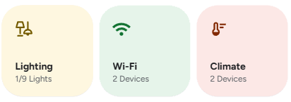
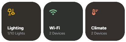
Material Dashboard Card is a custom card for Home Assistant inspired by the design language of the Google Home app. It provides a clean, compact, and interactive dashboard with dynamic buttons for controlling cameras, lighting, Wi-Fi, and climate devices all in a swipeable layout.
✨ Features
- Clean and modern Material-style design.
- Swipeable layout using
swipe-cardfor a compact multi-panel view. - Dynamic buttons with automatic device count (e.g., "3/5 lights on").
- Custom navigation support for each button.
- Conditionally hide buttons based on your preferences.
- Dark and light mode compatible.
🧩 Requirements
- Home Assistant ≥ 2023.5
- HACS
- The following custom cards installed:
🛠️ Configuration
Here are the configuration options for the material-dashboard-card:
🆓 Free Version
| Name | Type | Description | Default | Required |
|---|---|---|---|---|
type | string | custom:material-dashboard-card | Required | ✅ Yes |
cameras | string | Navigation path for the cameras button. | ✅ Yes | |
hide_cameras | boolean | Set to true to hide the cameras button. | false | ❌ No |
lighting | string | Navigation path for the lighting button. | ✅ Yes | |
hide_lighting | boolean | Set to true to hide the lighting button. | false | ❌ No |
wifi | string | Navigation path for the Wi-Fi button. | ✅ Yes | |
hide_wifi | boolean | Set to true to hide the Wi-Fi button. | false | ❌ No |
climate | string | Navigation path for the climate button. | ✅ Yes | |
hide_climate | boolean | Set to true to hide the climate button. | false | ❌ No |
✨ Pro - Ultimate Version
| Name | Type | Description | Default | Required |
|---|---|---|---|---|
type | string | custom:material-dashboard-card | Required | ✅ Yes |
cameras | string | Navigation path for the cameras button. | ✅ Yes | |
hide_cameras | boolean | Set to true to hide the cameras button. | false | ❌ No |
lighting | string | Navigation path for the lighting button. | ✅ Yes | |
hide_lighting | boolean | Set to true to hide the lighting button. | false | ❌ No |
wifi | string | Navigation path for the Wi-Fi button. | ✅ Yes | |
hide_wifi | boolean | Set to true to hide the Wi-Fi button. | false | ❌ No |
climate | string | Navigation path for the climate button. | ✅ Yes | |
hide_climate | boolean | Set to true to hide the climate button. | false | ❌ No |
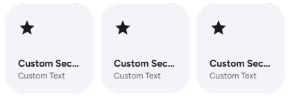
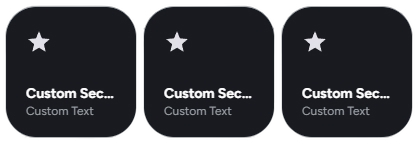
custom_sections | array | Array of custom sections. | false | ❌ No |
✨ Custom Section
NOTE
You can use the [[[ ]]] Template for name, label, icon, color, background_color, path and hidden.
See Javascript Templates for more information.
| Name | Type | Description | Default | Required |
|---|---|---|---|---|
name | string | Name of the custom section. | ✅ Yes | |
label | string | Label for the custom section. | ✅ Yes | |
icon | string | Navigation path for the cameras button. | ✅ Yes | |
color | string | The text, icon color for the section | ❌ No | |
background_color | string | The Background color for the section. | ❌ No | |
path | string | Navigation path for the custom section | ✅ Yes | |
hidden | boolean | Set to true to hide the Custom Section. | false | ❌ No |
🚀 Usage Examples
Basic Configuration
Add the card to your dashboard and define navigation paths for the buttons you want to display.
type: custom:material-dashboard-card
cameras: /lovelace/cameras
lighting: /lovelace/lighting
wifi: /lovelace/network
climate: /lovelace/climate
Hiding Buttons
There are two ways to hide buttons:
- Omit the navigation path: If you don't provide a path (e.g.,
cameras), the button does not be able to navigate. - Use the
hide_*flag: You can explicitly hide a button by setting its correspondinghide_*option totrue. This is useful if you want to temporarily disable a button without removing its navigation path from the configuration.
Example: Hiding the Wi-Fi button
type: custom:material-dashboard-card
cameras: /lovelace/cameras
lighting: /lovelace/lighting
wifi: /lovelace/network # Path is saved for later
hide_wifi: true # But the button is hidden
climate: /lovelace/climate
Example: Showing only Lighting and Climate
In this case, we simply omit the cameras and wifi configurations.
type: custom:material-dashboard-card
lighting: /lovelace/lighting
climate: /lovelace/climate
🎨 Extended Customization
⚠️ LICENSE
Only for PRO and ULTIMATE users, get your licence now 🚀.
This card have a own version of Card-Mod. You can inject custom CSS to override any style or create unique animations.
💡 ADVANCED STYLING
👉 Check out the Styling Guide.