💬 Material Dialog Card
NOTE
✨ Available on 💎 Ultimate Version Only
✨ Overview
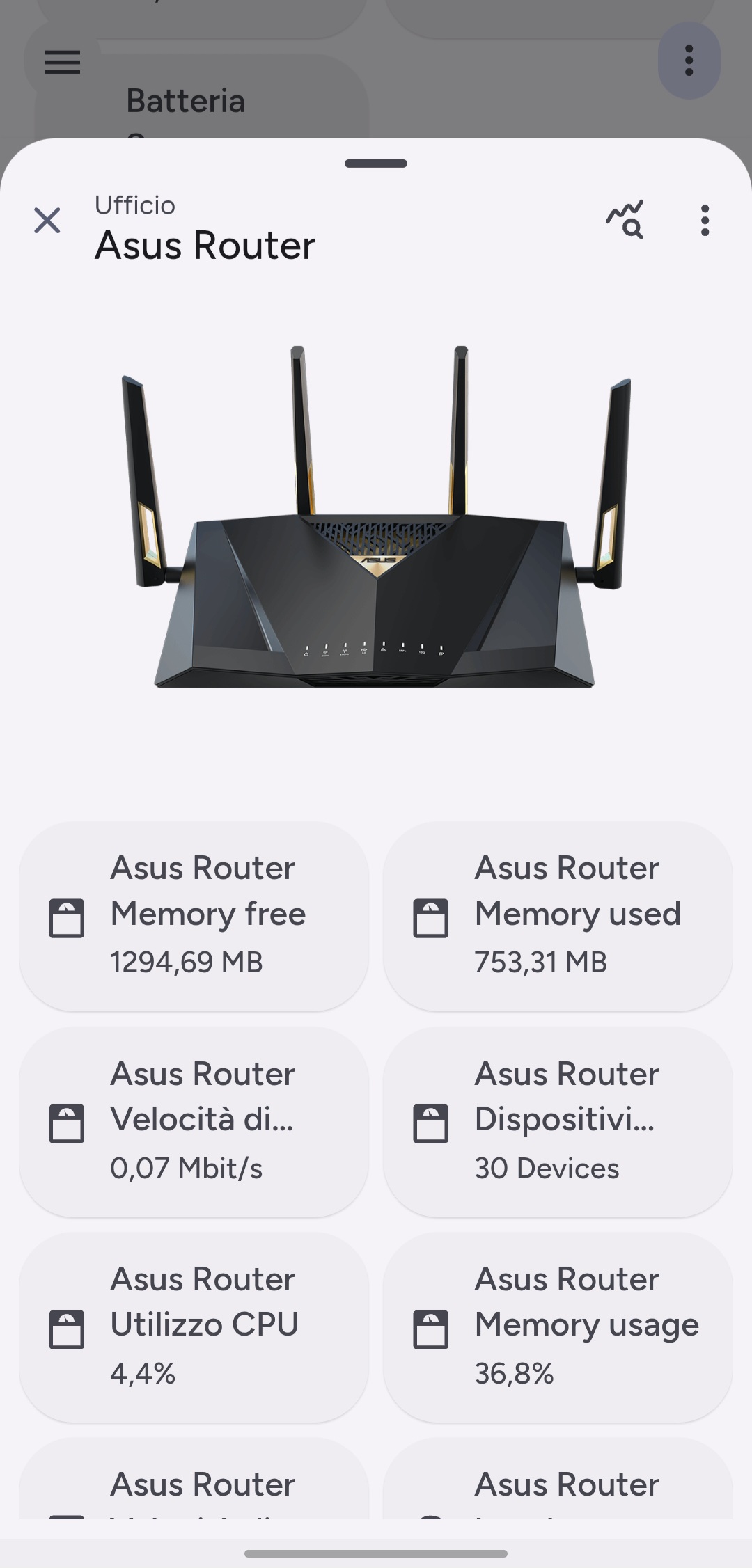
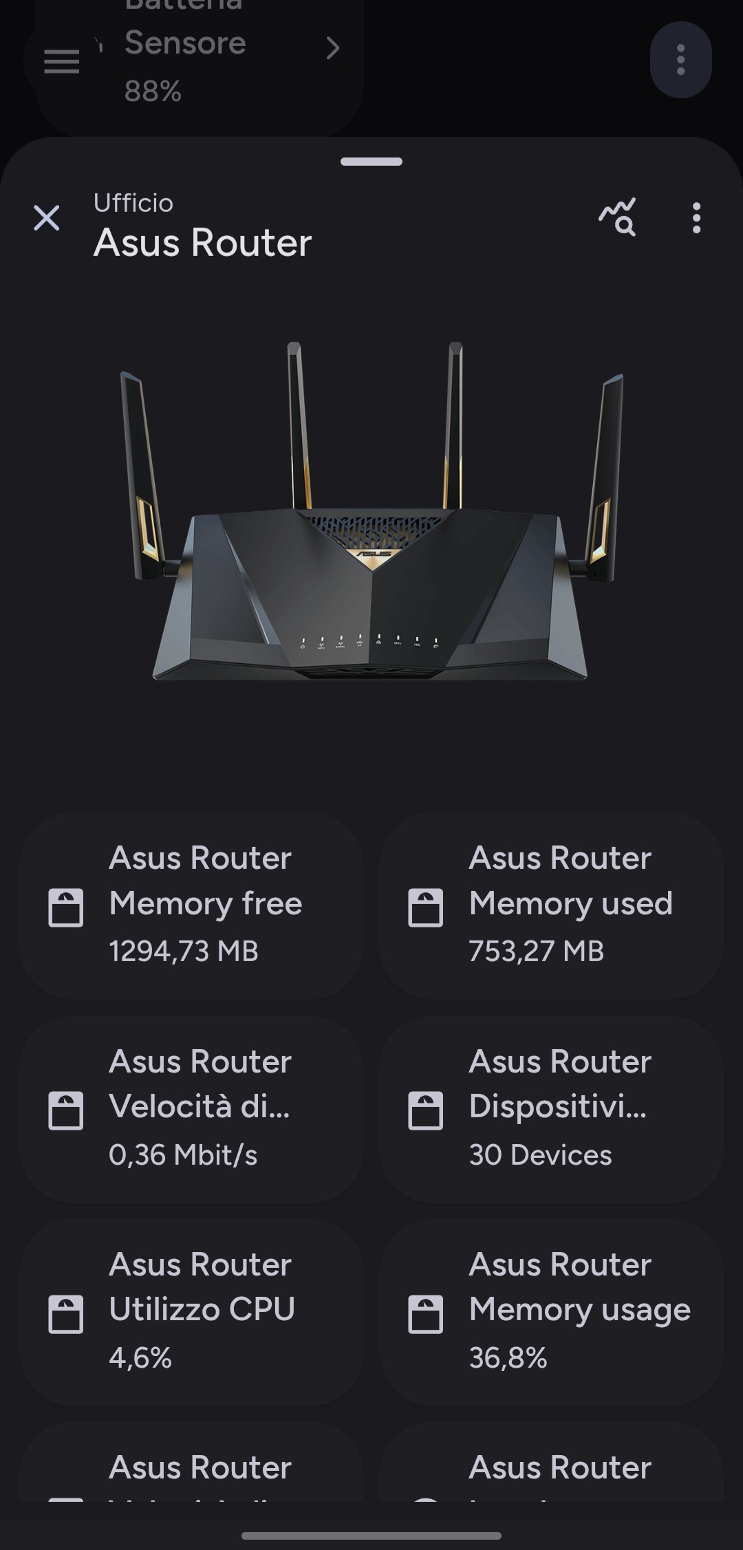
The Material Dialog Card brings native-like dialog interactions to your dashboard. Designed to display detailed information or controls without leaving the current view, it supports a wide range of content cards and seamless hash-based navigation.
✨ Key Features
- Hash Navigation: Opens effortlessly using URL hashes (e.g.,
#dialog), making it easy to link from other cards. - Adaptive Layout: Automatically adjusts between a centered dialog and a full-screen view based on device size.
- Rich Header: Includes customizable titles, icons, area indicators, and action buttons.
- Dropdown Menus: Supports overflow menus in the header for secondary actions.
- Flexible Content: Can host any combination of Lovelace cards inside the dialog body.
⚙️ Configuration
| Name | Type | Default | Description |
|---|---|---|---|
type | string | Required | custom:material-dialog-card |
hash | string | #dialog | The URL hash that triggers this dialog to open. |
cards | list | [] | A list of cards to display inside the dialog body. |
header | object | Optional | Configuration for the dialog header. |
settings | object | Optional | Additional behavior settings. |
Header Options (header)
| Name | Type | Default | Description |
|---|---|---|---|
name | string | Entity Name | Title text displayed in the header. |
entity | string | Optional | Entity used to derive name and state. |
button_type | string | name | Controls header display: state or name. |
show_area | boolean | true | Displays the area associated with the entity. |
sub_buttons | list | [] | List of icon buttons displayed in the header. |
dropdown_buttons | list | [] | List of items for the overflow dropdown menu. |
Settings Options (settings)
| Name | Type | Default | Description |
|---|---|---|---|
show_old_dialog | boolean | false | Forces the use of the legacy ha-dialog instead of ha-adaptive-dialog. |
🚀 Usage Examples
Example Configuration:
yaml
type: custom:material-dialog-card
hash: "#living-room-climate"
header:
  entity: climate.living_room
  name: Living Room Climate
  show_area: true
  sub_buttons:
    - icon: mdi:cog
      tap_action:
        action: navigate
        navigation_path: /config/integrations
cards:
  - type: thermostat
    entity: climate.living_room
  - type: entities
    entities:
      - entity: sensor.living_room_humidity
      - entity: sensor.living_room_temperature