
📝 Material Template Card
NOTE
✨ Available on 💎 Pro & Ultimate Version Only
🌟 Overview
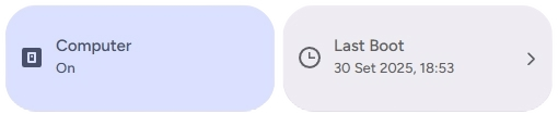
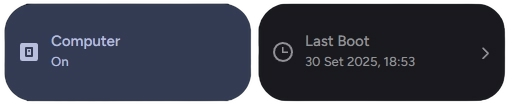
The Material Template Card is a highly flexible, expressive card designed for Home Assistant Lovelace dashboards. It empowers you to build fully dynamic visual tiles with live-evaluated templates using either Home Assistant native Jinja2 or client-side JavaScript ([[[ ... ]]]) expressions.
Whether creating unified sensor summary tiles, customized status indicators, or navigation links with trailing chevrons, the card adheres strictly to the Material 3 (M3) Expressive design system with dynamic tokens, smooth press states, and full responsive support.
✨ Features
- 🪄 Dual Templating Support: Seamlessly evaluate both Jinja2 (Home Assistant native) and JavaScript (
[[[ return ... ]]]) expressions in real-time. - 🎨 Adaptive & Custom Color Theming: Dynamically compute icon color, text color, and card background color using templates or CSS tokens.
- 🏷️ Dynamic Titles & Subtitles: Custom labels evaluated based on entity attributes, multi-sensor states, or math operations.
- 🖼️ Dynamic Icons: Dynamically switch icons based on sensor state, time of day, or system mode.
- ➡️ Navigation Chevron: Optional trailing chevron (
show_shavron_icon) for clean, intuitive dashboard menus. - 👆 Rich Touch Interactions: Native support for single tap, long press (
hold_action), and double tap (double_tap_action). - 🚨 Dynamic Alert & Problem Colors: Automatically highlights the card with Material 3 error tokens when an entity reports an active hazard, problem, low battery (<= 15%), or triggered alarm (unless custom colors are set in the configuration).
- ⚠️ Offline Handling: Gracefully adapts visual appearance when an associated entity is unavailable or disconnected.
- 🛠️ Smart Visual Editor: Visual form editor with categorized expansion panels and automatic cleanup of initial placeholder values.
🖥️ Visual Editor Preview
When adding a new material-template-card via the Home Assistant visual Lovelace editor, a placeholder preview is displayed to illustrate layout and styling:
- Name:
"Template Card" - Subtitle (
label):"Edit this card to get started" - Icon:
mdi:help-circle-outline
TIP
Automatic Stub Cleanup: These placeholder values are only provided for instant visual feedback in the card picker. The moment you interact with any field in the visual editor (e.g., selecting an entity or entering a title), these default placeholder texts are automatically removed, keeping your YAML configuration clean and minimal.
🛠️ Configuration Options
Below is the complete reference of configuration options available for the material-template-card:
| Option | Type | Description | Default | Required |
|---|---|---|---|---|
type | string | Must be custom:material-template-card. | - | ✅ Yes |
entity | string | Primary entity ID to bind to the card. 🆔 | - | ❌ No |
name | string | Card title. Supports Jinja2 and JavaScript templating expressions. 📛 | - | ❌ No |
label | string | Subtitle text displayed below the name. Supports Jinja2 and JavaScript templating expressions. 📜 | - | ❌ No |
icon | string | Custom icon (e.g. mdi:home-thermometer). Supports Jinja2 and JavaScript templating expressions. ✨ | - | ❌ No |
show_shavron_icon | boolean | Displays a trailing navigation chevron arrow (mdi:chevron-right) on the right edge. ➡️ | false | ❌ No |
icon_color | string | Color code or CSS variable for the icon. Supports templating. 🎨 | - | ❌ No |
text_color | string | Color code or CSS variable for title and subtitle text. Supports templating. 🔡 | - | ❌ No |
background_color | string | Color code or CSS variable for the card background. Supports templating. 🌈 | - | ❌ No |
tap_action | object | Action to perform on single tap (e.g. toggle, more-info, navigate, call-service). 👆 | - | ❌ No |
hold_action | object | Action to perform on long press. ⏱️ | - | ❌ No |
double_tap_action | object | Action to perform on double tap. ⚡ | - | ❌ No |
🔗 Templating Engine Guide
The card offers comprehensive support for dynamic templating, allowing you to use both Home Assistant's native syntax (Jinja2) and JavaScript expressions to evaluate states, attributes, and styles in real-time.
The following fields support templating: name, icon, text, icon_color, text_color, and background_color.
1. JavaScript Expressions ([[[ ... ]]])
Client-side JavaScript provides maximum performance and flexibility for mathematical calculations, multi-entity comparisons, and conditional styling:
- Wrap expressions inside
[[[ ... ]]]. - Access entities via
states['<entity_id>']. - Access attributes via
states['<entity_id>'].attributes.<attribute_name>. - Use ternary operators or multi-statement blocks returning a string or CSS variable.
name: "[[[ return states['light.living_room'].attributes.friendly_name ]]]"
label: "[[[ return states['light.living_room'].state === 'on' ? 'Brightness: ' + states['light.living_room'].attributes.brightness : 'Turned Off' ]]]"
icon_color: "[[[ return states['light.living_room'].state === 'on' ? 'var(--google-yellow-500)' : 'var(--google-grey-500)' ]]]"
2. Jinja2 Syntax (Home Assistant Native)
Home Assistant's native template engine is ideal for familiar expressions and entity attribute lookups:
label: "{{ states('sensor.living_room_temperature') }}°C • {{ states('sensor.living_room_humidity') }}%"TIP
For a comprehensive guide, ready-to-use code snippets, and structured examples on how to make the most of both engines, check out our Template Configurations Documentation.
⚠️ Note: Highly complex templates, loops, or advanced custom JS scripts must be configured and edited directly via the YAML editor.
🚀 Usage Examples
1. Smart Light Entity with Dynamic States
A dynamic light card whose icon, subtitle, and icon color reflect the entity's current state and brightness level.
type: custom:material-template-card
entity: light.living_room_lights
name: Living Room Lights
icon: "[[[ return states['light.living_room_lights'].state === 'on' ? 'mdi:lightbulb' : 'mdi:lightbulb-off' ]]]"
label: "[[[ return states['light.living_room_lights'].state === 'on' ? 'Active (' + Math.round((states['light.living_room_lights'].attributes.brightness || 0) / 2.55) + '%)' : 'Off' ]]]"
icon_color: "[[[ return states['light.living_room_lights'].state === 'on' ? 'var(--md-sys-color-primary)' : 'var(--md-sys-color-outline)' ]]]"
tap_action:
  action: toggle
hold_action:
  action: more-info
2. Menu Navigation Item with Chevron
An elegant navigation link with a trailing chevron arrow for sub-views.
type: custom:material-template-card
name: Climate & Heating
label: View temperature zones and thermostats
icon: mdi:thermostat
show_shavron_icon: true
tap_action:
  action: navigate
  navigation_path: /lovelace/climate
3. Multi-Sensor Environmental Summary
Combines temperature, humidity, and air quality from multiple sensors into a single card with dynamic alert colors.
type: custom:material-template-card
entity: sensor.indoor_air_quality
name: Living Room Climate
icon: mdi:home-thermometer
label: "[[[ return states['sensor.indoor_temp'].state + '°C  |  ' + states['sensor.indoor_humidity'].state + '% Humidity' ]]]"
icon_color: "[[[ return Number(states['sensor.indoor_temp'].state) > 26 ? 'var(--google-red-500)' : 'var(--google-blue-500)' ]]]"
tap_action:
  action: more-info
4. Dynamic Background & Text Styling
Dynamically changes the card background color based on an alarm or security state.
type: custom:material-template-card
entity: alarm_control_panel.home_alarm
name: Security System
label: "[[[ return 'Status: ' + states['alarm_control_panel.home_alarm'].state.toUpperCase() ]]]"
icon: "[[[ return states['alarm_control_panel.home_alarm'].state === 'disarmed' ? 'mdi:shield-check' : 'mdi:shield-alert' ]]]"
background_color: "[[[ return states['alarm_control_panel.home_alarm'].state === 'triggered' ? 'var(--md-sys-color-error-container)' : '' ]]]"
text_color: "[[[ return states['alarm_control_panel.home_alarm'].state === 'triggered' ? 'var(--md-sys-color-on-error-container)' : '' ]]]"
tap_action:
  action: more-info
🎨 Extended Customization
⚠️ LICENSE
The Material Template Card is an exclusive component for 💎 Pro & Ultimate supporters. Obtain your official license and unlock the complete Material Home Assistant suite on materialhomeassistant.com 🚀.
This card includes native support for Card-Mod, allowing you to inject custom CSS styles, animations, or token overrides directly.
💡 ADVANCED STYLING
👉 Check out the Styling & Card-Mod Guide.