💡 Light & Switch Dialogs
NOTE
✨ Available on 💎 Ultimate Version Only
✨ Overview
The Light & Switch Dialogs provide a clean, Google-style toggle interface for light, switch, and other binary entities. They are designed for quick, straightforward control, allowing you to turn devices on or off with a simple, satisfying interaction.
These dialogs are perfect for entities that don't need complex controls, offering a focused and minimalist user experience.
✅ How to Open the Dialogs
These dialogs open automatically. There is no need for manual configuration.
- If you do not define a
hold_action, the appropriate dialog will open automatically when you hold the card. - The default tap action for these entities is to toggle their state (
on/off).
Example: The dialog is automatic on hold
type: custom:material-button-card
entity: switch.coffee_machine
# No hold_action needed! The switch-dialog will open on hold.
ℹ️ Action trigger
| Dialog | Action Type | Card Type | Entity Domain / Type |
|---|---|---|---|
light-dialog | hold_action | material-button-card, material-options-card, material-circle-progress-card | light (on/off only) |
switch-dialog | hold_action | material-button-card, material-options-card, material-circle-progress-card | switch, input_boolean, automation |
🏷️ Customization with Labels
The Material Dialog supports specific Labels to give you full control over what is displayed. By applying labels like Dialog Hidden or Template in the Home Assistant entity settings, you can declutter your interface or fix layout issues for helpers.
TIP
To learn how to hide entities or manage template sensors, visit the Labels Configuration Guide.
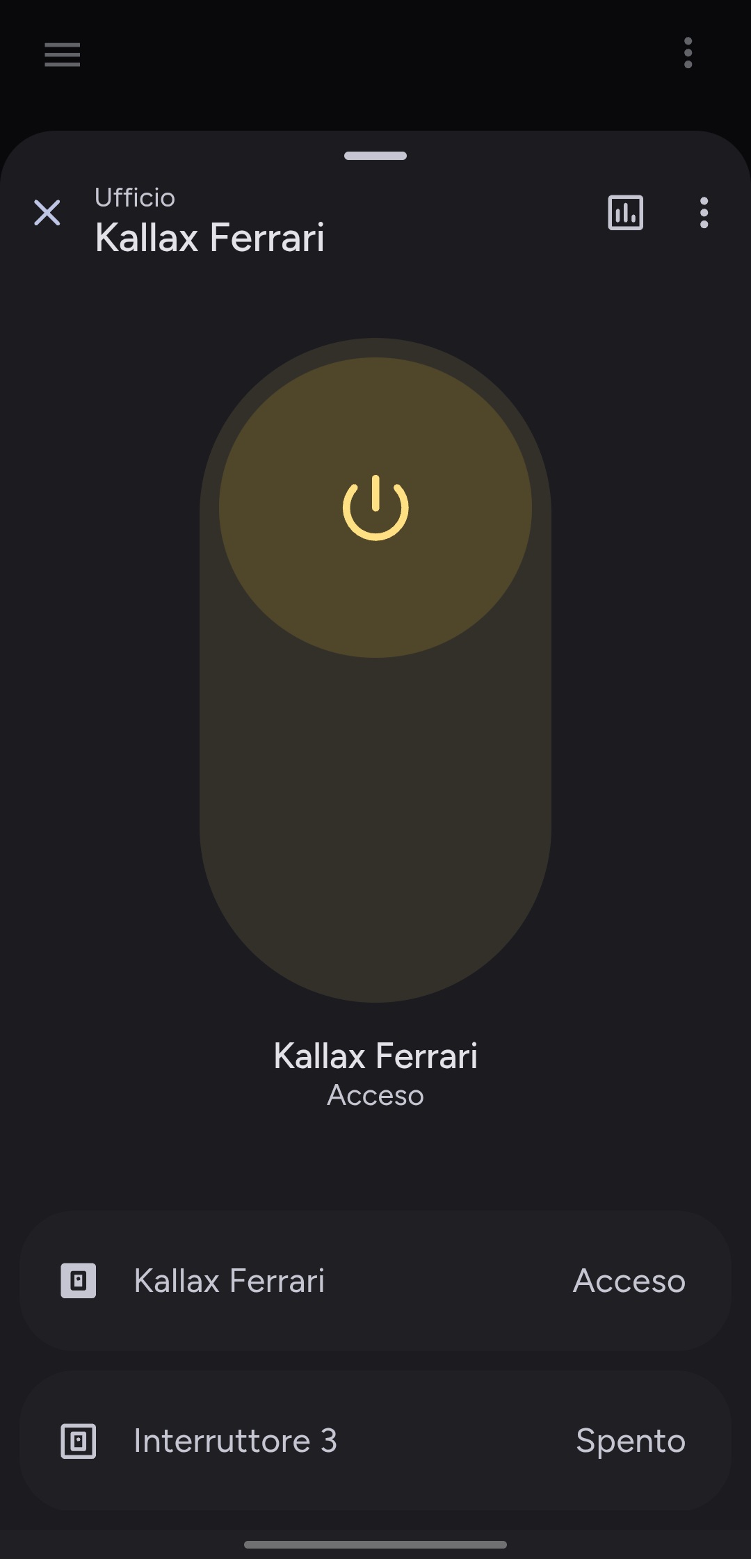
💡 Light Dialog
✨ Overview
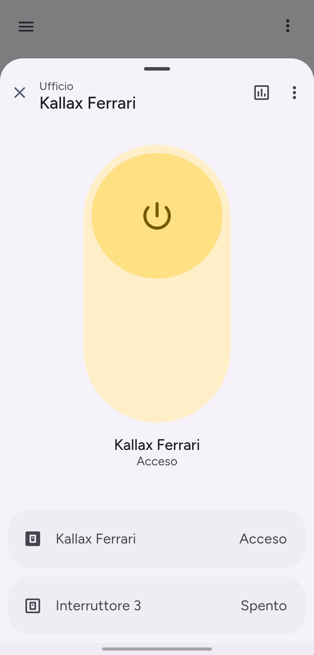
The light-dialog is specifically styled for light entities, featuring a yellowish background effect when the light is on, mimicking a warm glow.
⚙️ Supported Entity Domains
| Domain | Note | Action Type |
|---|---|---|
light | Only for lights that support on/off. Lights with brightness or color controls will open the default Home Assistant more-info dialog. | hold_action |
🎨 Dialog Features
| Feature | Description |
|---|---|
| Glow Effect | A subtle, warm background glow appears when the light is on. |
| Simple Toggle | A large, centered toggle for easy on/off control. |
| Responsive Layout | Provides a clean, focused view on both mobile and desktop. |
💡 Example Use Cases
- Hold a simple light switch card → quickly toggle it from a focused dialog without accidental taps.
- Use for non-dimmable lights like accent lighting or indicators.
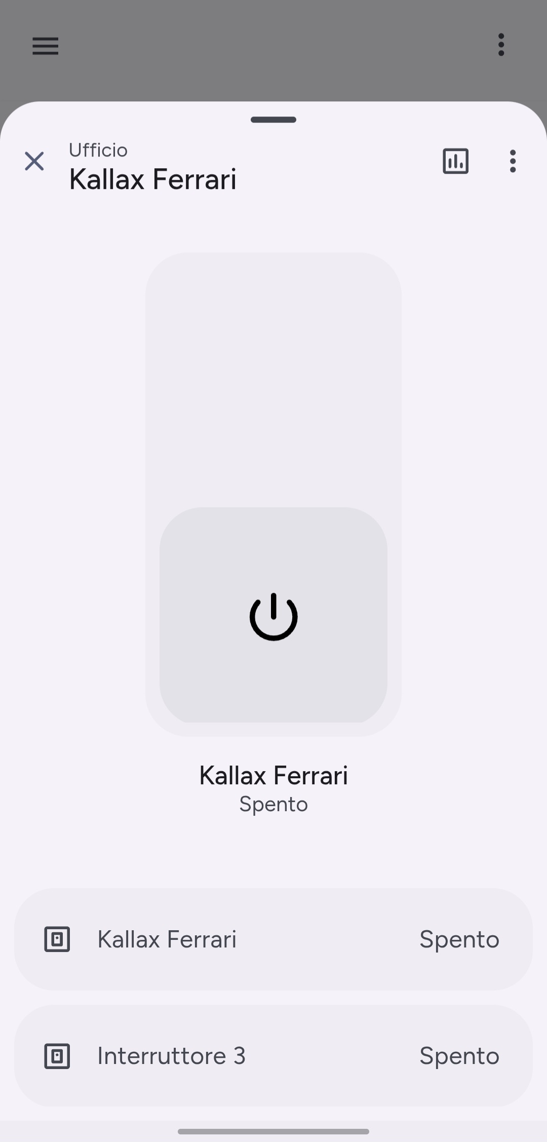
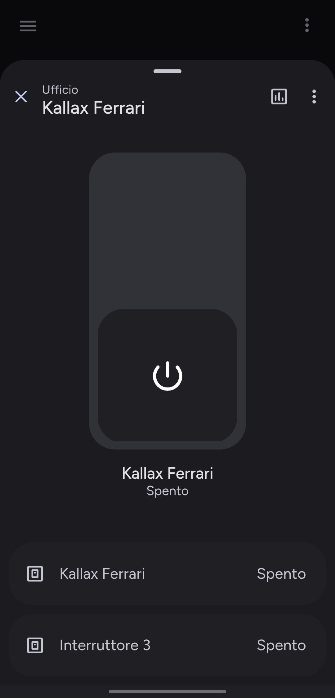
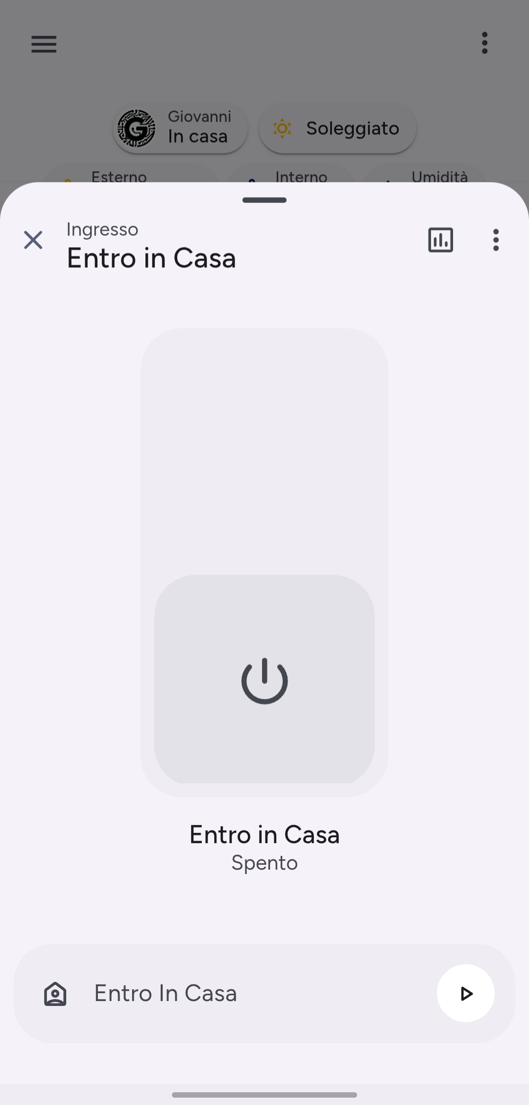
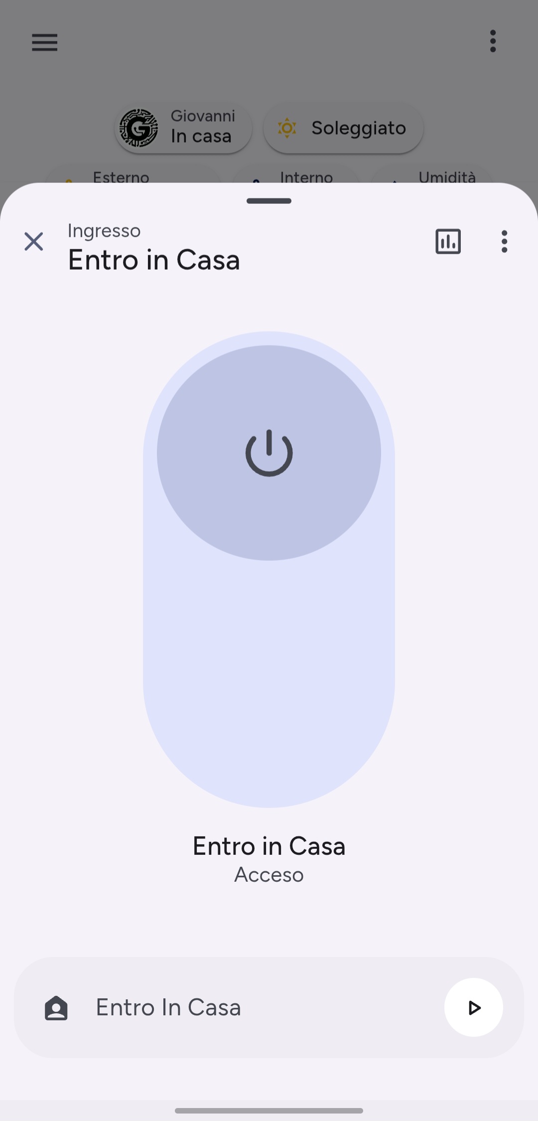
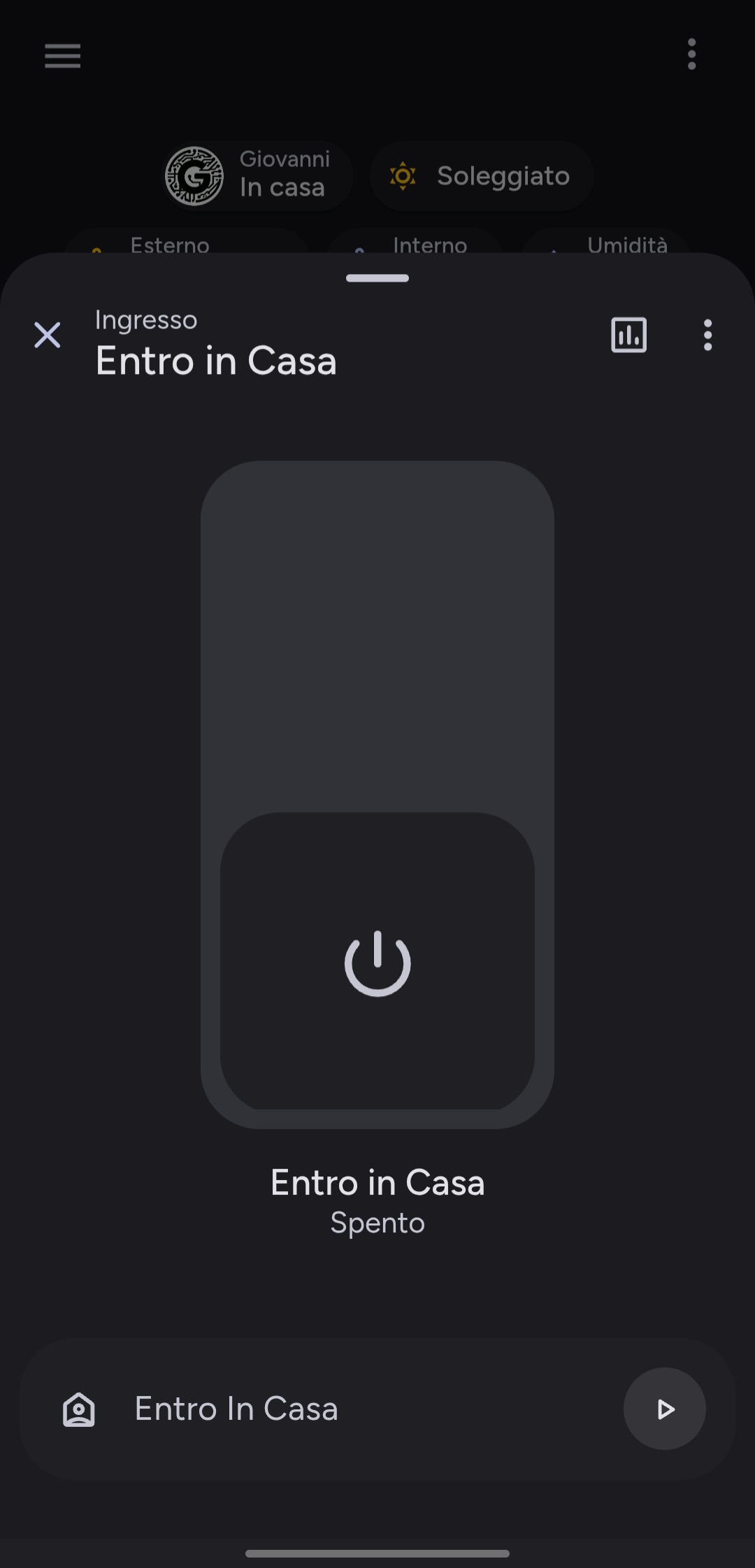
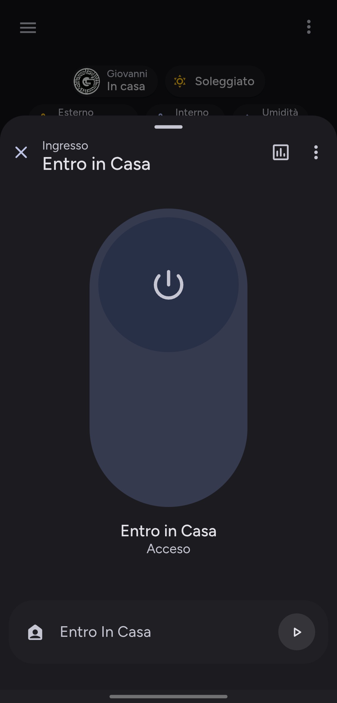
🎛️ Switch Dialog
✨ Overview
The switch-dialog is designed for general-purpose binary entities. It uses neutral theme colors for its on/off state, making it suitable for a wide range of devices.
⚙️ Supported Entity Domains
| Domain | Description | Action Type |
|---|---|---|
switch | For any standard switch entity. | hold_action |
input_boolean | For helper toggles and input booleans. | hold_action |
automation | For enabling/disabling automations. | hold_action |
🎨 Dialog Features
| Feature | Description |
|---|---|
| Neutral Theme | Uses your theme's primary colors for the on state, ensuring a consistent look. |
| Simple Toggle | A large, centered toggle for clear on/off control. |
| Versatile | Can be used for a wide variety of binary entities beyond just switches. |
💡 Example Use Cases
- Hold a coffee machine switch → toggle power from a dedicated dialog.
- Hold an automation card → quickly enable or disable it without navigating to the Automations dashboard.
- Hold an input_boolean used for a guest mode or other helper.