⭕ Material Circle Progress Card
NOTE
✨ Available on 💎 Pro & Ultimate Version Only
✨ Overview
The Material Circle Progress Card is a versatile card designed to visualize sensor data in a circular progress format. Perfect for displaying battery levels, humidity, or any percentage-based sensor, it adheres to the Material Design guidelines for a clean and modern look.
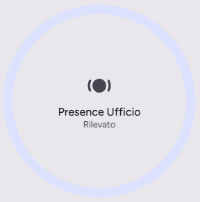
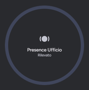
⭕ Sensor View
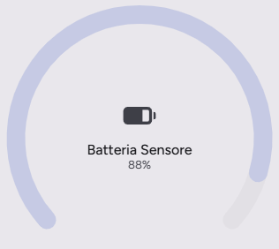
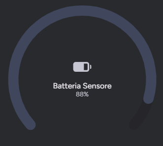
🔋 Battery View
✨ Key Features
- Circular Progress Indicator: Visualizes percentage values with a sleek circular arc.
- Dynamic State Representation: Automatically adapts colors based on the state (e.g., active/inactive).
- Customizable Actions: Supports tap, hold, and double-tap actions to trigger automations or navigate views.
- Theme Support: Seamlessly integrates with Light and Dark modes.
- Responsive Design: optimized for both mobile and desktop views.
⚙️ Configuration
| Name | Type | Default | Description |
|---|---|---|---|
type | string | Required | custom:material-circle-progress-card |
entity | string | Required | The entity ID of the sensor to display (e.g., sensor.battery_level). |
name | string | Optional | Overrides the friendly name of the entity. |
icon | string | Optional | Overrides the default icon of the entity. |
tap_action | object | Optional | Action to perform on tap. |
hold_action | object | Optional | Action to perform on hold. |
double_tap_action | object | Optional | Action to perform on double tap. |
🚀 Usage Examples
Example Configuration:
yaml
type: custom:material-circle-progress-card
entity: sensor.living_room_humidity
name: Umidità Salotto
icon: mdi:water-percent
tap_action:
  action: more-info
🎨 Extended Customization
⚠️ LICENSE
Only for PRO and ULTIMATE users, get your licence now 🚀.
This card have a own version of Card-Mod. You can inject custom CSS to override any style or create unique animations.
💡 ADVANCED STYLING
👉 Check out the Styling Guide.