📈 Material Graph Card
NOTE
✨ Available on 💎 Pro & Ultimate Version Only
🌟 Overview
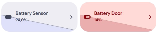
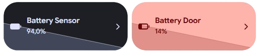
The Material Graph Card is an ultra-sleek, expressive sparkline card designed for Home Assistant Lovelace dashboards. It renders clean, hardware-accelerated SVG historical trend curves directly behind entity metrics, inspired by the Material 3 (M3) Expressive design system.
Whether you are monitoring ambient temperature, room humidity, home power consumption, or device battery percentages, the card provides instant visual context with smooth entrance animations, real-time data fetching, and automated threshold alerts.
✨ Features
- 📊 Minimalist Sparkline Graph: Renders a vector-based smooth SVG curve and semi-transparent area fill that adapts seamlessly to your dashboard grid.
- 🕒 Configurable History Window: Fetch and visualize data from the last hour up to 30 days (
1to720hours). - 🔋 Smart Low Battery Alerts: Automatically shifts the card to Material 3 error container tones (
--md-sys-color-error-container) when battery levels drop below your custom threshold. - 📏 Height Customization: Tune the vertical proportion of the sparkline curve (
max_heightfrom 10% to 100%) to match your layout density. - 🎨 Adaptive & Custom Color Schemes: Use standard Material 3 secondary container tokens or define custom colors for the graph line and area fill.
- ⚡ Real-Time History Fetching: Subscribes to Home Assistant entity state changes and queries the native History API (
history/period) with automatic fallbacks for static sensors. - 🪄 JavaScript Templating: Full support for inline JS expressions (
[[[ return ... ]]]) across name, subtitle, icon, and colors. - 👆 Rich Touch Actions: Native support for
tap_action,hold_action, anddouble_tap_actionwith custom dialog integration. - 📱 Touch-First & Responsive: Includes tactile press effects, tactile ripple feedback, and automatic text scrolling for long values.
🖥️ Visual Editor Preview
When adding a new material-graph-card using the Home Assistant visual Lovelace editor, a pre-configured preview is automatically suggested:
- Entity: Automatically detects and picks an active battery sensor or numeric sensor from your instance.
- Hours to Show: Defaults to
24hours. - Max Height: Defaults to
60. - Low Battery Alert: Pre-enabled with a threshold of
15%.
TIP
Smart Field Reset: Default placeholder values are provided solely for live UI visualization. As soon as you configure your own entity or adjust a setting in the visual editor, the placeholder configuration cleanly updates to your custom specifications.
🛠️ Configuration Options
Below is the complete reference of all available options for custom:material-graph-card:
📋 Main Options
| Option | Type | Description | Default | Required |
|---|---|---|---|---|
type | string | Must be custom:material-graph-card. | - | ✅ Yes |
entity | string | The numeric sensor or helper entity ID to track (e.g. sensor.temperature, input_number.target_temp). | - | ✅ Yes |
name | string | Custom title displayed on the card. Supports JS templates. Falls back to entity friendly name. | Entity friendly name | ❌ No |
label | string | Secondary subtitle text below the name. Supports JS templates. Falls back to formatted state + unit. | Formatted state & unit | ❌ No |
icon | string | Custom icon identifier (e.g. mdi:thermometer, m3o:battery-charging-full). Supports JS templates. | Entity icon | ❌ No |
show_shavron_icon | boolean | Displays an arrow chevron indicator on the right edge to signal navigability. | false | ❌ No |
📈 Graph & History Settings
| Option | Type | Description | Default | Required |
|---|---|---|---|---|
hours_to_show | number | Number of historical hours to retrieve and plot (min: 1, max: 720). | 24 | ❌ No |
max_height | number | Maximum vertical height of the sparkline curve inside the SVG canvas (min: 10, max: 100). | 60 | ❌ No |
default_color | boolean | If true, applies Material 3 expressive secondary container tokens to the graph line and fill. | true | ❌ No |
graph_color | string | Custom color (HEX, RGB, or CSS variable) applied to the sparkline. Used when default_color is false. | var(--md-sys-color-secondary-...) | ❌ No |
low_battery_color | boolean | Enables automatic alert coloring when a battery entity drops below the configured limit. | false (in YAML) / true (UI stub) | ❌ No |
low_battery_level | number | Battery percentage threshold that triggers the low battery alert state (0 - 100). | 15 | ❌ No |
🎨 Styling & Appearance
| Option | Type | Description | Default | Required |
|---|---|---|---|---|
background_color | string | Custom background color or CSS variable override for the card container. Supports JS templates. | var(--ha-card-background) | ❌ No |
text_color | string | Custom text color for the title and subtitle elements. Supports JS templates. | var(--primary-text-color) | ❌ No |
icon_color | string | Custom color for the leading icon. Supports JS templates. | var(--primary-text-color) | ❌ No |
👆 Action Handlers
| Option | Type | Description | Default | Required |
|---|---|---|---|---|
tap_action | object | Action executed on single click/tap. Standard Home Assistant action object (more-info, navigate, etc). | action: more-info | ❌ No |
hold_action | object | Action executed on touch-and-hold (long press). | action: none | ❌ No |
double_tap_action | object | Action executed on quick double click/tap. | action: none | ❌ No |
🚀 Usage Examples
1. Ambient Temperature Sensor (24 Hours)
Standard temperature monitor with default Material 3 styling and 24-hour historical trend:
type: custom:material-graph-card
entity: sensor.living_room_temperature
name: Living Room Temperature
hours_to_show: 24
max_height: 60
tap_action:
  action: more-info
2. Device Battery Monitor with Low Battery Warning
Monitors smartphone or sensor battery level over 48 hours. When battery drops below 20%, the entire card automatically illuminates in Material 3 warning/error container styling:
type: custom:material-graph-card
entity: sensor.pixel_phone_battery_level
name: Smartphone Battery
hours_to_show: 48
low_battery_color: true
low_battery_level: 20
max_height: 65
3. Energy Consumption with Custom Emerald Accent
Custom emerald sparkline color tracking total solar production or instantaneous grid power over 12 hours:
type: custom:material-graph-card
entity: sensor.solar_power_production
name: Solar Production
icon: mdi:solar-power-variant
default_color: false
graph_color: "#10b981"
hours_to_show: 12
max_height: 75
tap_action:
  action: navigate
  navigation_path: /energy
4. Climate Sensor with Navigation Chevron
Displays room humidity with an interactive right chevron that guides the user directly to the environmental dashboard:
type: custom:material-graph-card
entity: sensor.bedroom_humidity
name: Bedroom Humidity
show_shavron_icon: true
hours_to_show: 24
tap_action:
  action: navigate
  navigation_path: /lovelace/climate
5. Advanced Dynamic JavaScript Templating
Leverage the power of the frontend JavaScript template engine to compute dynamic labels, icons, and status text in real time:
type: custom:material-graph-card
entity: sensor.server_cpu_temperature
name: "[[[ return 'Server CPU • ' + states['sensor.server_cpu_load'].state + '%' ]]]"
label: "[[[ return states['sensor.server_cpu_temperature'].state > 75 ? '⚠️ Thermal Throttling' : 'Optimal Cooling' ]]]"
icon: "[[[ return states['sensor.server_cpu_temperature'].state > 75 ? 'mdi:fire' : 'mdi:cpu-64-bit' ]]]"
icon_color: "[[[ return states['sensor.server_cpu_temperature'].state > 75 ? 'var(--google-red-500)' : 'var(--google-blue-500)' ]]]"
hours_to_show: 6
max_height: 50
🪄 Dynamic Templating Guide
The card supports JavaScript template expressions evaluated instantly on your device via evaluateTemplateEngine:
- Enclose your expression between
[[[ ... ]]]. - Access states using
states['<entity_id>'].stateand attributes viastates['<entity_id>'].attributes.<attribute>. - Return strings, numbers, or CSS color declarations (
var(--...),#hex,rgb(...)).
TIP
Templates can be applied to name, label, icon, background_color, text_color, and icon_color. Complex multi-line expressions or custom calculations should be written directly in the YAML code editor. For a comprehensive guide, ready-to-use code snippets, and structured examples on how to make the most of both engines, check out our Template Configurations Documentation.
🎨 Extended Customization
⚠️ LICENSE
The Material Graph Card is an exclusive feature for 💎 Pro & Ultimate supporters. Obtain your official license and unlock the complete Material Home Assistant suite on materialhomeassistant.com 🚀.